

When it comes to designing our new interiors, a lot of us tend to focus on floor plans, elevations, new furniture and how to get the newest technology into our homes. Colors often become pretty accessories and little thought is put into creating the right color palette for the property and for its residents. This can turn out to be a big mistake, as the colors we chose (or don’t chose) will determine in large part the atmosphere of our rooms and how we subconsciously feel every time we step into them.
Colors are so important to us because they are a construct of our minds to help us perceive visible electromagnetic waves. This means that we simply cannot picture life without colors and over time we have grown to associate certain emotions and feelings with each one. The famous psychoanalyst Jung even said: “colors are the mother tongue of the subconscious”.
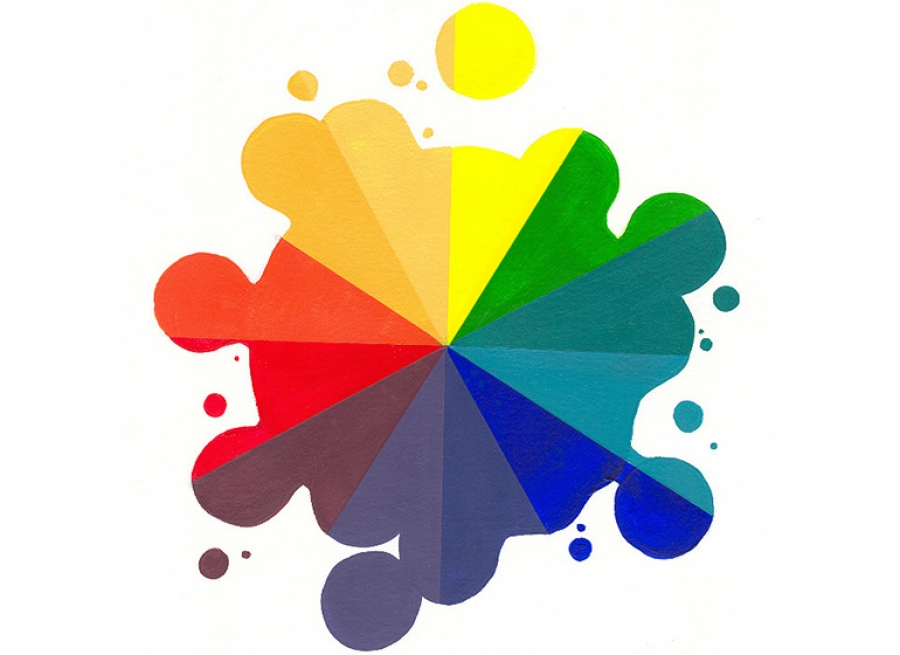
But enough theory, here are the basics on how colors usually affect us in the context of interior design.
Warm colors
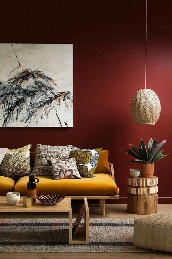
Red, through its various shades, symbolizes power, passion, love, strength and danger. As such it can be used to warm up spaces, make them feel more intimate or nourishing and even to provoke appetite in dining rooms or kitchens. Be careful though as using red as the main color of a room can be a recipe for a sense of restlessness and agitation.
Orange, a calmer version of red, can also be overwhelming if used in abundance, however it is a great color to use for accents (the sofa below is a great example) and artwork. This color represents energy, courage, happiness and creativity: all great for offices, kids rooms and kitchens.
Yellow is the color of warmth, prosperity and general cheeriness. But its not all sunshine and happiness, yellow is also linked to feelings of anxiety and definitely beware of its different shades; dull yellow denotes sickness and decay to many people. We thus believe is best to stick to light or bright yellows that can really uplift an interior space. Unless you are looking at exterior house paint, we would recommend using yellow sparingly and pairing it, similarly to red and orange, with more calming colors to liven up spaces, especially in kitchens, dining rooms and hallways.
Cool colors
Purple, the color of royalty and luxury, will give any room an elegant and dramatic look. It is best used in bedrooms and living rooms, where we are looking for a relaxing yet sophisticated atmosphere. Purple is also great for creativity, good news for those of us who like to work from the sofa or the bed :) !
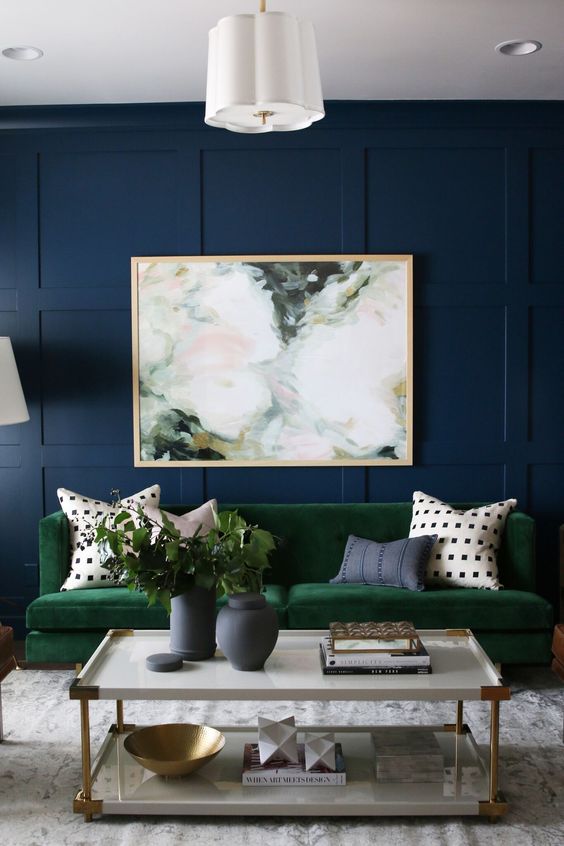
Green symbolizes nature and as such is the most calming and relaxing color. It is extremely versatile and can be used in any room for any purpose, from a corporate office to a tiny cottage’s bedroom. It looks great in interior spaces with large garden facing windows or doors, and also if used monochromatically paired with white.
If the earth is green, then the sky is blue, making this color almost as soothing but far fresher (and a great partner for green!). Blue is one of the world’s favorite colors and it represents trust, intelligence and confidence. We think that it is suitable for any space, especially considering all its different shades. Light blue can help cool down a room, whilst a dark blue can give strength and character to interiors.
From off the color wheel
Brown is a warm, relaxing color that symbolizes reliability, security and protection. It is closely linked with comfort and can be used in interiors, particularly through furniture and cabinetry, to make spaces feel more comfy, cozy and friendly. Because of this, we think that it works particularly well in living and dining rooms, where the best ‘friends and family time’ happens. I would definitely sit and chat in the room pictured below, wouldn't you?
Black is the both the color of power and death, making it a tough choice to work into interiors. Its intensity can easily overpower a room and make it seem oppressive, however it adds refinement and class if used for accents or statement pieces. It can also be paired with white, to add depth, contrast and attract attention.
Gray is the transition of white and black and as such is a very detached, unemotional color. This neutral property makes it so popular and a relaxed, calming choice that works very well with other colors. It is often used as a base color in many designs, together with cool blues and purples or more intense blacks, oranges or reds. It is a favorite for neutral rooms like bathrooms, hallways and offices.
What can we say about white? We saved it for last because of its dominance across interior design as both the canvas and the artwork. White symbolizes cleanliness, youth, perfection, innocence and faith, all whilst having the ability to open up rooms, making them feel larger and livelier. Woohoo, easy peasy then... let's paint it all white, right? Hold your horses! Despite being a combination of all visible colors, white rarely goes well alone and we need to pair with other colors and accents to bring it to life. See the pictures above and below for some inspiration on using white!
Remember that these associations and emotional effects vary based on color hues and personal differences (such as culture, gender and age), so it is very important to ask yourself what particular colors mean to you and what feelings you want each room to provoke. Also always consider light sources (natural and artificial!) and other colors or accents that will be present in that room. As a closing thought, here is a little game to remind you of the importance of matching colors to their surroundings.
Look at A and B in this picture.
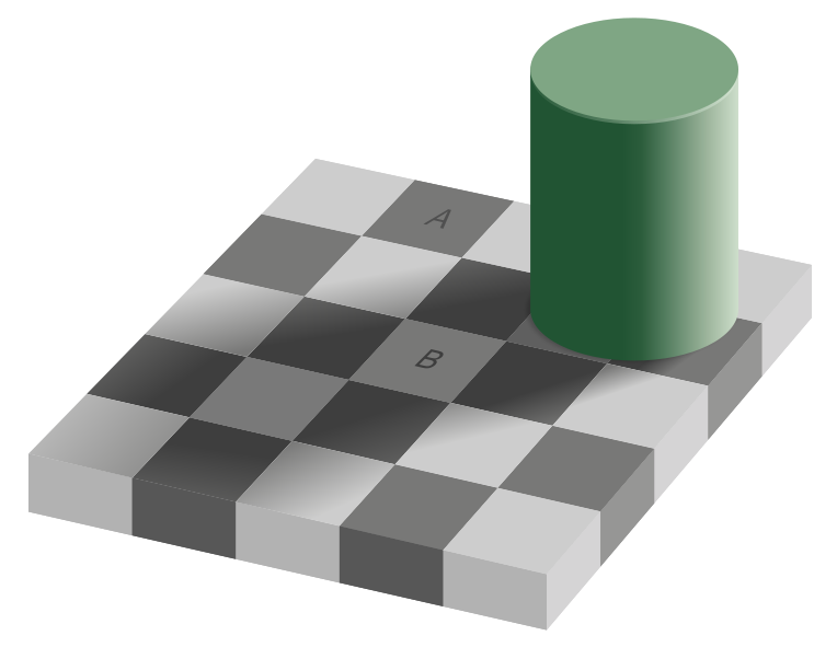

Pretty different right? Now look at them here.


Quite surprisingly they are the same exact color! Yet the surroundings and shadows trick our eyes! These tricky colors pose quite a few interior-designing problems; I’m sure you can relate if you have ever tried picking paint colors for a room. So make sure to visualize colors in their specific environment and to consider how your color palette works together, maybe with the help of a mood board (see our post on mood boards here) or an interior designer from Érd! :)
